
记录一下,方便以后使用…
效果
如图很显然,一般情况下我们需要的效果并不是这样的。
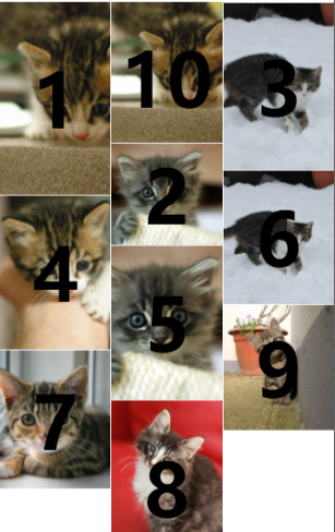
印象中的瀑布流应该是
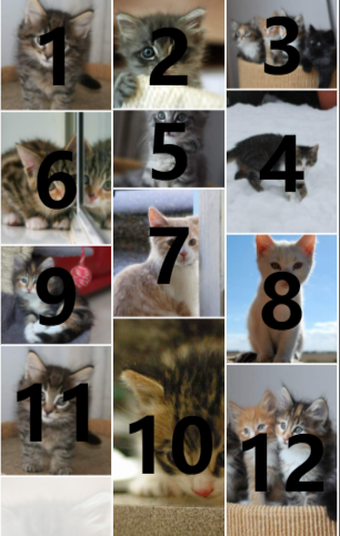
以下是两种效果的实现
前提
先要有一个自动适配高度的图片组件,小程序我不知道怎么写样式让它像H5一样,所以就写了一个组件来做这样一件事。
auto-image
根据已知宽度自动适配自身高度的组件。
index.js
Component({
  properties: {
    src: {
      type: String,
      value: ''
    },
    mode: {
      type: String,
      value: 'aspectFill'
    }
  },
  data: {
    width: 'auto',
    height: 'auto',
    loaded: false
  },
  methods: {
    imageLoad(e) {
      this.createSelectorQuery().select('.in-image-content').boundingClientRect().exec(([{ width: conWidth }]) => {
        // 获取图片的源宽度/高度
        let { width, height } = e.detail
        // 获取比例
        let scale = width / conWidth
        // 宽度赋值
        width = conWidth;
        // 高度比例缩放
        height /= scale
        // 高度取整
        height = Math.round(height)
        this.setData({ width: `${width}px`, height: `${height}px`, loaded: true })
        this.triggerEvent('loaded', { width, height })
      })
    }
  }
})
index.wxml
<view class="in-image-content {{loaded?'show':''}}">
  <image class="in-image-content__image" src="{{src}}" mode="{{mode}}" style="width: {{width}};height: {{height}};" bindload="imageLoad"></image>
  <view class="in-image-content__slot" hidden="{{!loaded}}">
    <slot></slot>
  </view>
</view>
index.wxss
:host {
  width: 100%;
}

.in-image-content {
  width: 100%;
  position: relative;
  break-inside: avoid;
  opacity: 0;
  transition: opacity .5s ease-in;
}

.in-image-content__image {
  display: block;
}

.in-image-content__slot {
  position: absolute;
  left: 0;
  top: 0;
  right: 0;
  bottom: 0;
}

.show {
  opacity: 1;
}
方案一
采用css样式column-count +循环取余 (本来想的是控制排序 结果有…)
index
index.json
引入组件
{
  "usingComponents": {
    "auto-image":"/components/auto-image/index"
  },
  "navigationBarTitleText": "瀑布流"
}
index.js
const minWidth = 200;
const minHeight = 250;
const maxWidth = 400;
const maxHeight = 500;
const pageSize = 10;
function getPlacekitten() {
  const rw = minWidth + Math.round(Math.random() * (maxWidth - minWidth))
  const rh = minHeight + Math.round(Math.random() * (maxHeight - minHeight))
  return `https://placekitten.com/${rw}/${rh}`
}

Page({
  data: {
    column: 3,
    images: []
  },
  onLoad() {
    this.loadMore()
  },
  loadMore() {
    const { images } = this.data
    for (let i = 0; i < pageSize; i++) {
      images.push(getPlacekitten())
    }
    this.setData({ images })
  },
  onReachBottom() {
    this.loadMore()
  }
})
index.wxml
<view class="masonry" style="column-count:{{column}}">
  <block wx:for="{{column}}" wx:for-item="columnNum" wx:key="unique">
    <block wx:for="{{images}}" wx:key="unique">
      <view wx:if="{{index%column==columnNum}}" class="item">
        <auto-image class="auto-image" src="{{item}}" >
          <view class="count">{{index+1}}</view>
        </auto-image>
      </view>
    </block>
  </block>
</view>
index.wxss
 .masonry {
   --gap: 1px;
   column-count: 2;
   column-gap: var(--gap);
   width: 100%;
 }

 .item {
   width: 100%;
   padding-bottom: var(--gap);
   transition: all .3s ease-in-out;
 }

 .count {
   display: flex;
   height: 100%;
   width: 100%;
   font-size: 80px;
   font-weight: bold;
   align-items: center;
   justify-content: center;
 }
方案二
index2
采用position: absolute;根据元素的高、距离顶部的距离、进行排列。
index.json
引入组件
{
  "usingComponents": {
    "auto-image":"/components/auto-image/index"
  },
  "navigationBarTitleText": "瀑布流"
}
index.js
// 图片大小范围
const minWidth = 200;
const minHeight = 250;
const maxWidth = 400;
const maxHeight = 500;
// 每次加载数量
const pageSize = 20;
// 获取图片地址
function getPlacekitten() {
  const rw = minWidth + Math.round(Math.random() * (maxWidth - minWidth))
  const rh = minHeight + Math.round(Math.random() * (maxHeight - minHeight))
  return `https://placekitten.com/${rw}/${rh}`
}
// 加载图片信息
function getImageInfo(src) {
  return new Promise((resovle) => {
    wx.getImageInfo({
      src,
      success: resovle
    })
  })
}
Page({
  data: {
    column: 3, // 列数
    gap: 2, // 间距 px
    images: [], // 图片地址 string []
    masonry: [], // 存储位置
    columnList: [] // 储存数据
  },
  onLoad() {
    this.loadMore()
  },
  async loadMore() {
    const { images } = this.data
    for (let i = 0; i < pageSize; i++) {
      let src = getPlacekitten();
      // 调整加载顺序
      await getImageInfo(src)
      this.setData({ [`images[${images.length}]`]: src })
    }
  },
  onReachBottom() {
    this.loadMore()
  },
  // 图片加载完成回调
  handleAutoImageLoaded(e) {
    const { index } = e.currentTarget.dataset;
    this.handlePosition(index, e.detail)
  },
  // 处理自动位置
  handlePosition(index, rect) {
    const { column, columnList } = this.data
    // 初始化列
    if (columnList.length === 0) for (let i = 0; i < column; i++) {
      columnList[i] = []
    }
    // 求最短的
    let shortIndex = -1;
    let shortHeight = -1;
    for (let i = 0; i < columnList.length; i++) {
      let tmpColList = columnList[i];
      // 数组最后一个位置
      let tmpLast = tmpColList[tmpColList.length - 1];
      // 判断上一个位置
      let tmpHeight = (tmpLast?.top ?? 0) + (tmpLast?.height ?? 0);
      if (shortHeight > tmpHeight || shortHeight === -1) {
        shortIndex = i;
        shortHeight = tmpHeight;
      }
    }
    rect.top = shortHeight > 0 ? shortHeight + this.data.gap : shortHeight;
    rect.left = shortIndex / column
    rect.style = `top:${rect.top}px;left:${rect.left * 100}%;`;
    columnList[shortIndex].push(rect)
    this.data.columnList = columnList;
    this.setData({ [`masonry[${index}]`]: rect })
  }
})
index.wxss
 .masonry {
   --gap: 2px;
   width: calc(100% - var(--gap));
   position: relative;
   margin-left: var(--gap);
 }

 .masonry-item {
   position: absolute;
   width: calc(100% / var(--column));
   padding-right: var(--gap);
   box-sizing: border-box;
 }


 .count {
   display: flex;
   height: 100%;
   width: 100%;
   font-size: 80px;
   font-weight: bold;
   align-items: center;
   justify-content: center;
 }
index.wxml
<view class="masonry" style="--column:{{column}};--gap:{{gap}}px;">
  <block wx:for="{{images}}" wx:key="unique">
    <view class="masonry-item" style="{{masonry[index].style}}">
      <auto-image class="auto-image" src="{{item}}" bind:loaded="handleAutoImageLoaded" data-index="{{index}}">
        <view class="count">{{index+1}}</view>
      </auto-image>
    </view>
  </block>
</view>
源码
https://developers.weixin.qq.com/s/Ce2rvdm47RDn
原文地址:http://www.cnblogs.com/linyisonger/p/16817800.html
1. 本站所有资源来源于用户上传和网络,如有侵权请邮件联系站长!
2. 分享目的仅供大家学习和交流,请务用于商业用途!
3. 如果你也有好源码或者教程,可以到用户中心发布,分享有积分奖励和额外收入!
4. 本站提供的源码、模板、插件等等其他资源,都不包含技术服务请大家谅解!
5. 如有链接无法下载、失效或广告,请联系管理员处理!
6. 本站资源售价只是赞助,收取费用仅维持本站的日常运营所需!
7. 如遇到加密压缩包,默认解压密码为"gltf",如遇到无法解压的请联系管理员!
8. 因为资源和程序源码均为可复制品,所以不支持任何理由的退款兑现,请斟酌后支付下载
声明:如果标题没有注明"已测试"或者"测试可用"等字样的资源源码均未经过站长测试.特别注意没有标注的源码不保证任何可用性