
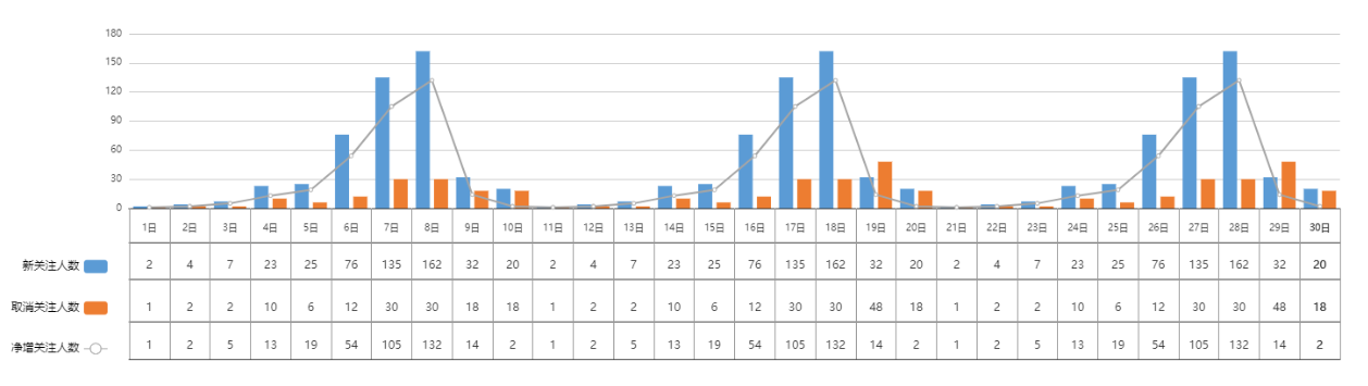
效果图如下:
代码如下:
<!DOCTYPE html>
<html>
    <head>
        <meta charset="UTF-8">
        <script type="text/javascript" src="js/echarts.js"></script>
    </head>
    <body>
        <div class="chart">
            <div id="lineBar" style="width: 100%;height:400px;"></div>
        </div>
        <script>
            var myCharte = echarts.init(document.getElementById('lineBar'));
            const colors = ['#5b9bd5', '#ed7d31', '#a5a5a5'];
            // 新关注人数
            var newData = [2, 4, 7, 23, 25, 76, 135, 162, 32, 20, 2, 4, 7, 23, 25, 76, 135, 162, 32, 20,2, 4, 7, 23, 25, 76, 135, 162, 32, 20]
            // 取消关注人数
            var cancelData = [1, 2, 2, 10, 6, 12, 30, 30, 18, 18, 1, 2, 2, 10, 6, 12, 30, 30, 48, 18,1, 2, 2, 10, 6, 12, 30, 30, 48, 18]
            // 净增关注人数
            var addData = [1, 2, 5, 13, 19, 54, 105, 132, 14, 2,1, 2, 5, 13, 19, 54, 105, 132, 14, 2,1, 2, 5, 13, 19, 54, 105, 132, 14, 2,]
            // 最大日期数量 0 开始
            var maxDate = 29;
            // 日期
            var dateDay = [];
            for (var i=1;i<maxDate+2;i++) {
                dateDay.push(`${i}日`)
            }

            option = {
                grid: {
                    x: 130,
                    y:45,
                    x2: 40,
                    y2: 170
                },
                tooltip: {
                    trigger: "axis",
                    axisPointer: {
                        type: "cross",
                        crossStyle: {
                            color: "#999"
                        }
                    }
                },
                legend: {
                    align: "right",
                    itemGap: 30,
                    orient: "vertical",
                    textStyle: {
                        color: "#000"
                    },
                    bottom: 10,
                    left: 0,
                    data: ["新关注人数", "取消关注人数", "净增关注人数"]
                },
                xAxis: [{
                        type: "category",
                        max: maxDate,
                        offset: 8,
                        interval: Math.ceil(12) / 12,
                        axisLabel: {
                            fontWeight: "bold",
                            show: true,
                            interval: 0, // 强制显示全部刻度名
                            textStyle: {
                                fontSize: "14px"
                            }
                        },
                        lineStyle: {
                            color: '#f00',
                            width: 1,
                            type: 'solid',
                        },
                        data: dateDay,
                    },
                    {//下方表格的竖线
                        position: "bottom", // 将分组x轴位置定至底部,不然默认在顶部
                        offset: 45, // 向下偏移,使分组文字显示位置不与原x轴重叠
                        axisTick: {
                            length: -160, // 延长刻度线做分组线
                            inside: true, // 使刻度线相对轴线在上面与原x轴相接,默认在轴线下方
                            lineStyle: {
                                color: "#999"
                            } // 非必须,仅为了演示,明显标示出分组刻度线
                        },
                        max: 29,
                        interval: 2,
                        axisLabel: {
                            inside: true, // 使刻度名称相对轴线在上面与原x轴相接,默认在轴线下方
                            interval: 0 // 强制显示全部刻度名
                        },
                        data: [""]
                    },
                    {//下方表格的竖线  第一条线
                        position: "bottom", // 将分组x轴位置定至底部,不然默认在顶部
                        offset: 0, // 向下偏移,使分组文字显示位置不与原x轴重叠
                        axisTick: {
                            length: -160, // 延长刻度线做分组线
                            inside: true, // 使刻度线相对轴线在上面与原x轴相接,默认在轴线下方
                            lineStyle: {
                                color: "#999"
                            } // 非必须,仅为了演示,明显标示出分组刻度线
                        },
                        max: 1,
                        data: [""]
                    },
                    {
                        position: "bottom", // 将分组x轴位置定至底部,不然默认在顶部
                        offset: 36, // 向下偏移,使分组文字显示位置不与原x轴重叠
                        max: 30,
                        axisTick: {
                          alignWithLabel: true,
                        },
                    },
                    {
                        position: "bottom", // 将分组x轴位置定至底部,不然默认在顶部
                        offset: 75, // 向下偏移,使分组文字显示位置不与原x轴重叠
                        max: maxDate,
                        interval: 1,
                        axisTick: {
                            length: 0, // 延长刻度线做分组线
                            inside: true, // 使刻度线相对轴线在上面与原x轴相接,默认在轴线下方
                        },
                        axisLabel: {
                            inside: true, // 使刻度名称相对轴线在上面与原x轴相接,默认在轴线下方
                            interval: 0 // 强制显示全部刻度名
                        },
                        data: newData
                    },
                    {
                        position: "bottom", // 将分组x轴位置定至底部,不然默认在顶部
                        offset: 120, // 向下偏移,使分组文字显示位置不与原x轴重叠
                        max: maxDate,
                        interval: Math.ceil(12) / 12,
                        axisTick: {
                            length: 0, // 延长刻度线做分组线
                            inside: true, // 使刻度线相对轴线在上面与原x轴相接,默认在轴线下方
                        },
                        axisLabel: {
                            inside: true, // 使刻度名称相对轴线在上面与原x轴相接,默认在轴线下方
                            interval: 0 // 强制显示全部刻度名
                        },
                        data: cancelData
                    },
                    {
                        position: "bottom", // 将分组x轴位置定至底部,不然默认在顶部
                        offset: 160, // 向下偏移,使分组文字显示位置不与原x轴重叠
                        max: maxDate,
                        interval: 0,
                        axisTick: {
                            length: 0, // 延长刻度线做分组线
                            inside: true, // 使刻度线相对轴线在上面与原x轴相接,默认在轴线下方
                            lineStyle: {
                                color: "#f00"
                            } // 非必须,仅为了演示,明显标示出分组刻度线
                        },
                        axisLabel: {
                            inside: true, // 使刻度名称相对轴线在上面与原x轴相接,默认在轴线下方
                            interval: 0 // 强制显示全部刻度名
                        },
                        data: addData
                    },
                ],
                yAxis: [{
                        type: "value",
                        axisLabel: {
                            formatter: "{value}",
                            textStyle: {
                                fontSize: "14px"
                            }
                        },
                        axisLine: {
                            show:false,
                        },
                        axisTick:{
                            show: false
                        },
                    },
                    {
                        show:false,
                    }
                ],
                series: [{
                        name: "新关注人数",
                        type: "bar",
                        data: newData,
                        itemStyle: {
                            color: colors[0]
                        }
                    },
                    {
                        name: "取消关注人数",
                        type: "bar",
                        data: cancelData,
                        itemStyle: {
                            color: colors[1]
                        }
                    },
                    {
                        name: "净增关注人数",
                        type: "line",
                        data: addData,
                        itemStyle: {
                            color: colors[2]
                        },
                        lineStyle: {
                            width: 2
                        }
                    },
                ]
            };
            myCharte.setOption(option);
        </script>
    </body>
</html>
echarts.js为本地的;
原文地址:http://www.cnblogs.com/yeziyou/p/16821990.html
1. 本站所有资源来源于用户上传和网络,如有侵权请邮件联系站长!
2. 分享目的仅供大家学习和交流,请务用于商业用途!
3. 如果你也有好源码或者教程,可以到用户中心发布,分享有积分奖励和额外收入!
4. 本站提供的源码、模板、插件等等其他资源,都不包含技术服务请大家谅解!
5. 如有链接无法下载、失效或广告,请联系管理员处理!
6. 本站资源售价只是赞助,收取费用仅维持本站的日常运营所需!
7. 如遇到加密压缩包,默认解压密码为"gltf",如遇到无法解压的请联系管理员!
8. 因为资源和程序源码均为可复制品,所以不支持任何理由的退款兑现,请斟酌后支付下载
声明:如果标题没有注明"已测试"或者"测试可用"等字样的资源源码均未经过站长测试.特别注意没有标注的源码不保证任何可用性