
最近抖音很火的让你会计算机的朋友给你做个爱心突然火了,我也不出意外的收到了朋友的邀请,自己做肯定太麻烦了于是乎百度第一步,惊呆了!网上全都是一个爱心,变着法的火焰爱心,换汤不换药,那我们肯定是要整点不一样的咯
首先要表达出我们的中心,是个爱心,其次是简单,再加点动画过渡大功告成!朋友后面跟我得瑟说别人的爱心都一样,还以为我们只能做一种爱心哈哈哈,虽然没有那个炫酷,但这是咱手工打造的“不撞衫”嘛
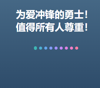
<html>

<head>
    <style>
        * {
            margin: 0;
            padding: 0;
            color: #FFF;
        }

        html,
        body {
            width: 100%;
            height: 100%;
        }

        body {
            background: linear-gradient(to top, #09203f 0%, #537895 100%);
        }

        .box {
            position: absolute;
            top: 200px;
            right: 0;
            left: 0;
            margin: auto;
            width: 300px;
            height: 300px;
        }

        h1 {
            text-align: center;
        }

        .heart {
            position: relative;
            font-size: 0;
            width: 138px;
            margin: 50px auto;
        }

        .heart>div {
            position: absolute;
            top: -5px;
            width: 10px;
            height: 10px;
            border-radius: 5px;
        }

        .h-line-4 {
            animation: h-line-move-4 3.8s infinite;
        }

        .h-line-3,
        .h-line-5 {
            animation: h-line-move-3 3.8s infinite;
        }

        .h-line-2,
        .h-line-6 {
            animation: h-line-move-2 3.8s infinite;
        }

        .h-line-1,
        .h-line-7 {
            animation: h-line-move-1 3.8s infinite;
        }

        .h-line-0,
        .h-line-8 {
            animation: h-line-move-0 3.8s infinite;
        }

        .h-line-0 {
            left: 0px;
            animation-delay: 0s;
            background-color: #3cba92;
            filter: hue-rotate(20deg);
        }

        .h-line-1 {
            left: 17px;
            animation-delay: 0.15s;
            background-color: #3cba92;
            filter: hue-rotate(40deg);
        }

        .h-line-2 {
            left: 34px;
            animation-delay: 0.3s;
            background-color: #3cba92;
            filter: hue-rotate(60deg);
        }

        .h-line-3 {
            left: 51px;
            animation-delay: 0.45s;
            background-color: #3cba92;
            filter: hue-rotate(80deg);
        }

        .h-line-4 {
            left: 68px;
            animation-delay: 0.6s;
            background-color: #3cba92;
            filter: hue-rotate(100deg);
        }

        .h-line-5 {
            left: 85px;
            animation-delay: 0.75s;
            background-color: #3cba92;
            filter: hue-rotate(120deg);
        }

        .h-line-6 {
            left: 102px;
            animation-delay: 0.9s;
            background-color: #3cba92;
            filter: hue-rotate(140deg);
        }

        .h-line-7 {
            left: 119px;
            animation-delay: 1.05s;
            background-color: #3cba92;
            filter: hue-rotate(160deg);
        }

        .h-line-8 {
            left: 136px;
            animation-delay: 1.2s;
            background-color: #3cba92;
            filter: hue-rotate(180deg);
        }

        @keyframes h-line-move-4 {

            0%,
            10%,
            90%,
            100% {
                height: 10px;
                top: -5px;
            }

            45%,
            55% {
                height: 94px;
                top: -23px;
            }
        }

        @keyframes h-line-move-3 {

            0%,
            10%,
            90%,
            100% {
                height: 10px;
                top: -5px;
            }

            45%,
            55% {
                height: 90px;
                top: -31px;
            }
        }

        @keyframes h-line-move-2 {

            0%,
            10%,
            90%,
            100% {
                height: 10px;
                top: -5px;
            }

            45%,
            55% {
                height: 80px;
                top: -37px;
            }
        }

        @keyframes h-line-move-1 {

            0%,
            10%,
            90%,
            100% {
                height: 10px;
                top: -5px;
            }

            45%,
            55% {
                height: 60px;
                top: -31px;
            }
        }

        @keyframes h-line-move-0 {

            0%,
            10%,
            90%,
            100% {
                height: 10px;
                top: -5px;
            }

            45%,
            55% {
                height: 30px;
                top: -15px;
            }
        }
    </style>
</head>

<body>
    <div class="box">
        <h1>为爱冲锋的勇士!<br />值得所有人尊重!</h1>
        <div class="heart">
            <div class="h-line-0"></div>
            <div class="h-line-1"></div>
            <div class="h-line-2"></div>
            <div class="h-line-3"></div>
            <div class="h-line-4"></div>
            <div class="h-line-5"></div>
            <div class="h-line-6"></div>
            <div class="h-line-7"></div>
            <div class="h-line-8"></div>
        </div>
    </div>
</body>

</html>
看成品

原文地址:http://www.cnblogs.com/dengsir39/p/16886352.html
1. 本站所有资源来源于用户上传和网络,如有侵权请邮件联系站长!
2. 分享目的仅供大家学习和交流,请务用于商业用途!
3. 如果你也有好源码或者教程,可以到用户中心发布,分享有积分奖励和额外收入!
4. 本站提供的源码、模板、插件等等其他资源,都不包含技术服务请大家谅解!
5. 如有链接无法下载、失效或广告,请联系管理员处理!
6. 本站资源售价只是赞助,收取费用仅维持本站的日常运营所需!
7. 如遇到加密压缩包,默认解压密码为"gltf",如遇到无法解压的请联系管理员!
8. 因为资源和程序源码均为可复制品,所以不支持任何理由的退款兑现,请斟酌后支付下载
声明:如果标题没有注明"已测试"或者"测试可用"等字样的资源源码均未经过站长测试.特别注意没有标注的源码不保证任何可用性