
在项目中遇到需要自定义底部的tabbar,首先需要了解底部tabbar最少2个最多5个,项目中可能会遇到自定义时底部的tabbar总个数超过5个的情况,
比如:在商家端小程序底部需要显示3个tabbar,客户端小程序也需要显示3个tabbar,此时商家端和客户端的tabbar都不相同,此时自定义就可以用到。
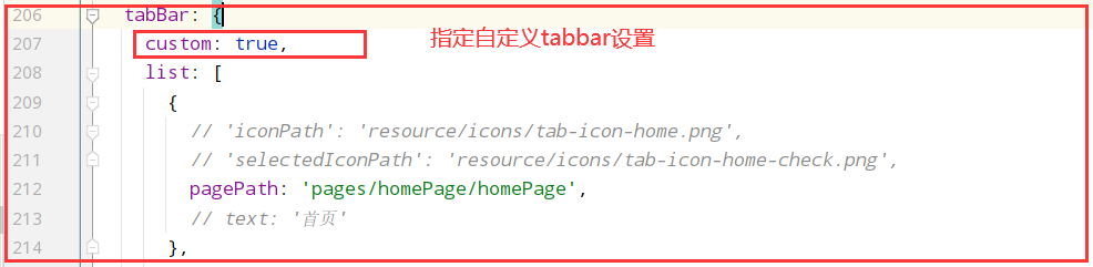
方法一: 就是根据app.config.js来设置自定义的tabbar,好处就是不用在页面中引入就可以使用
步骤一:在app.config.js中增加自定义tabbar开关custom:true
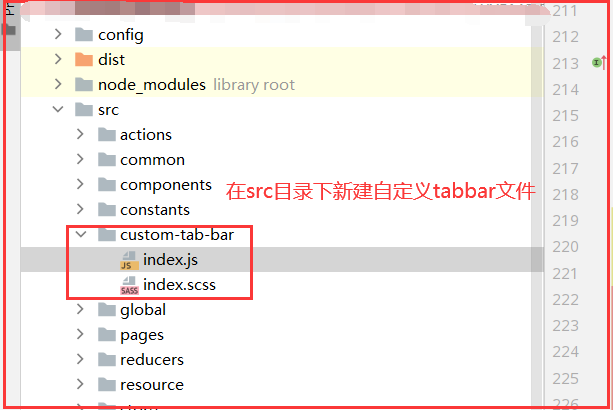
步骤二: 在src目录下新建custom-tab-bar组件
大部分的内容,不可直接复制粘贴使用,代码进行了简单的替换,注意文件名称 customTabBar 首字母要小写,如果是大写是自定义组件写法,如果项目使用了redux,建议将TabList数据放在redux中
/**
 * 页面底部导航栏下标
 * */
export const PageTabBarEnum = {

  TabHomePage: 1,    // 自有小程序首页
  TabOrderDishesPage: 2,  // 点餐首页
  TabMemberPage: 3,   // 会员中心页
  TabPdwHomePage: 4,   // 平台小程序首页
  TabPdwOrderListPage: 5,  // 平台订单列表页
  TabPdwMemberPage: 6   // 平台小程序会员
}

// 外卖平台
const PlatformEnum = {
  Merchant: 0,
  Pdw: 1,
}

const TabList = [
  {
    pagePath: '/pages/...',  // 路由
    text: '首页',
    platform: PlatformEnum.Merchant,
    tabbar: PageTabBarEnum.TabHomePage,
    iconPath: '../../resource/icons/tab-icon-home.png',
    selectedIconPath:  '../../resource/icons/tab-icon-home-check.png'
  }, {
    pagePath: '/pages/...',
    text: '点餐',
    platform: PlatformEnum.Merchant,
    tabbar: PageTabBarEnum.TabOrderDishesPage,
    iconPath: '../../resource/takeout/pdw-tab-order.png',
    selectedIconPath: '../../resource/takeout/pdw-tab-order-check.png'
  }, {
    pagePath: '/pages/...',
    text: '会员',
    platform: PlatformEnum.Merchant,
    tabbar: PageTabBarEnum.TabMemberPage,
    iconPath: '../../resource/icons/tab-icon-member.png',
    selectedIconPath: '../../resource/icons/tab-icon-member-check.png'
  }, {
    pagePath: '/pages/...',
    text: '首页',
    platform: PlatformEnum.Pdw,
    tabbar: PageTabBarEnum.TabPdwHomePage,
    iconPath: '../../resource/takeout/pdw-tab-home.png',
    selectedIconPath: '../../resource/takeout/pdw-tab-home-check.png'
  },  {
    pagePath: '/pages/...',
    text: '订单',
    platform: PlatformEnum.Pdw,
    tabbar: PageTabBarEnum.TabPdwOrderListPage,
    iconPath: '../../resource/takeout/pdw-tab-order.png',
    selectedIconPath: '../../resource/takeout/pdw-tab-order-check.png'
  },  {
    pagePath: '/pages/...',
    text: '我的',
    platform: PlatformEnum.Pdw,
    navigateTo: true,
    tabbar: PageTabBarEnum.TabPdwMemberPage,
    iconPath: '../../resource/takeout/pdw-tab-my.png',
    selectedIconPath: '../../resource/takeout/pdw-tab-my-check.png'
  }
]

class customTabBar extends Component {

  static propTypes = {
    TabBar: PropsType.number,   // 当前tabbar
    onChangeTabbar: PropsType.func,  // 修改tabbar
  }

  state = {
    selected: 0,  // 当前激活的tab下标
    color: '#000',  // 字体颜色
    selectedColor: '#00bab4',  // 激活的字体颜色
    backgroundColor: '#ffffff',  // 背景色
    borderStyle: 'black',   // 边框颜色
  }

  componentDidMount() {
  }

  /*
  * 获取平台类型*/
  IsPdwPlatform = () => {
    return PlatformEnum.Merchant
  }

  /**
   * 获取底部Tab列表
   * */
  getTabList = () => {
    // 这里判断平台来区分需要显示的tabbar  这里IsPdwPlatform 函数需要自己实现
    let platform = this.IsPdwPlatform() ? PlatformEnum.Pdw : PlatformEnum.Merchant;
    let tabs = TabList.filter(item => item.platform === platform);
    let tabList = tabs.map(item => {
      return {...item}
    });
    return tabList;
  }

  render() {
    const {TabBar} = this.props;
    let TabList = this.getTabList();
    return (
      <CoverView className={classnames('custom-tab')}>
        {
          TabList.map((item, index) => {
            return <CoverView className='custom-tab-item' onClick={this.switchTab.bind(this, item)}
                              data-path={item.pagePath} key={index}>
              <CoverImage className='custom-tab-item-img'
                          src={TabBar === item.tabbar ? item.selectedIconPath : item.iconPath}/>
              <CoverView className='custom-tab-item-text'
                         style={{color: TabBar === item.tabbar ? this.state.selectedColor : this.state.color}}>
                {item.text}
              </CoverView>
            </CoverView>
          })
        }
      </CoverView>
    )
  }

  /**
   * 切换Tab
   * */
  switchTab = (tabData) => {
    let that = this;
    const {pagePath, navigateTo, tabbar} = tabData;
    if (navigateTo) {
      Taro.navigateTo({
        url: pagePath
      })
    } else {
      Taro.switchTab({
        url: pagePath,
        success: () => {
          that.props.onChangeTabbar(tabbar);  // 记录当前切换的底部tab
        }
      })
    }
  }
}

const mapStateToProps = (state) => {
  const {TabBar} = state[StoreKeys.GlobalStore];
  return {
    TabBar: TabBar,
  };
};

const mapDispatchToProps = {
  onChangeTabbar    // 记录底部获取焦点的tab
};

export default connect(mapStateToProps, mapDispatchToProps)(customTabBar)
.custom-tab {
  //display: none;
  display: flex;
  flex-direction: row;
  justify-content: space-around;
  position: fixed;
  bottom: 0;
  width: 100vw;
  height: 50Px;
  border-radius: 0;
  box-sizing: border-box;
  border-top: 1Px solid #f1f1f1;
  background-color: #FFFFFF;

  &-item {
    flex: 1;
    display: flex;
    flex-direction: column;
    justify-content: center;
    align-items: center;
    position: relative;

    &-img {
      margin: 0 auto;
      width: 28PX;
      height: 28Px;
    }

    &-text {
      margin-top: 4Px;
      font-size: 10Px;
    }
  }
}

.show-custom-tab {
  display: flex;
  flex-direction: row;
  justify-content: space-around;
}
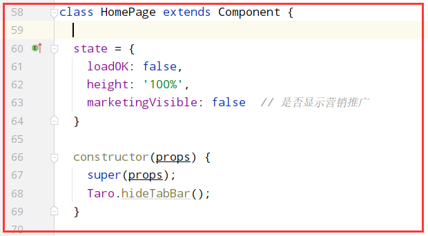
方法二:在页面中使用Taro.hideTabBar() 隐藏底部Tabbar,并创建自定义Tarbar组件,在页面中引入,Tabbar组件就直接使用上面方法一组件CustomTabBar,文件名要大写
同时在app.config.js的tabBar的list配置中,只配置pagePath的路由,否则页面在显示时会先看到配置中的tabbar,然后又显示自定义的,只配置pagePath,底部只会看到一个空白的,
组件的样式要记得添加z-index,否则有可能因为position属性被页面其他组件遮挡

方法一与方法二区别不大,方法一好处是不用在页面中引入组件,方法二是组件引入的方式,需要引入
原文地址:http://www.cnblogs.com/wind-wang/p/16798285.html
1. 本站所有资源来源于用户上传和网络,如有侵权请邮件联系站长!
2. 分享目的仅供大家学习和交流,请务用于商业用途!
3. 如果你也有好源码或者教程,可以到用户中心发布,分享有积分奖励和额外收入!
4. 本站提供的源码、模板、插件等等其他资源,都不包含技术服务请大家谅解!
5. 如有链接无法下载、失效或广告,请联系管理员处理!
6. 本站资源售价只是赞助,收取费用仅维持本站的日常运营所需!
7. 如遇到加密压缩包,默认解压密码为"gltf",如遇到无法解压的请联系管理员!
8. 因为资源和程序源码均为可复制品,所以不支持任何理由的退款兑现,请斟酌后支付下载
声明:如果标题没有注明"已测试"或者"测试可用"等字样的资源源码均未经过站长测试.特别注意没有标注的源码不保证任何可用性